
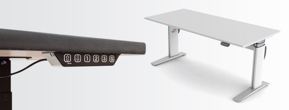
How Next Keeps Everyday Technology Simple
Next focuses on the essentials: clear product choices, practical design, and a storefront that makes it easy to compare devices at a glance. This post page keeps the same visual rhythm as the homepage while presenting the kind of article content a WordPress site typically needs.
Whether the visitor arrives from a menu item, a product detail page, or a blog listing, the structure stays familiar. The header, navigation, and footer remain consistent, while the center content shifts to a readable article layout with a featured image and supporting sections.
What the page highlights
- A clean article body with a strong headline and metadata.
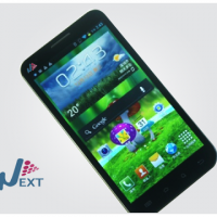
- A featured visual that matches the brand’s existing product imagery.
- Short supporting sections that make the content easy to scan.
Why this layout works
The theme uses restrained colors, simple borders, and centered alignment. By keeping the post content inside the same frame, the article feels like part of the same site rather than a separate experience. It also keeps the layout light enough for quick updates in WordPress.
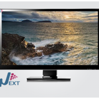
A product-focused hero image keeps the page aligned with the existing store visuals while leaving room for post content alongside it.
Featured products
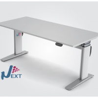
Table
$230.00
Monitor
$345.90
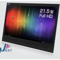
Tablet
$487.00
Phone
$250.00